The box model
The box model is one of the most fundamental elements of CSS, and yet it's often one of the most common mistakes I see made when debugging other people's code. If you don't get your layout right, then it's incredibly hard to get anything else on your website to look the way you want it. I'm going to go through the basics of the main display types, the box model as it relates to each of these, and how to use these to their fullest.
So what makes up the box model
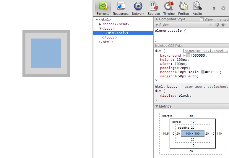
The box model it all the layout properties of an HTML element. It consists of height, width, padding, border and margin. While it doesn't directly include the position and the offset of an element, depending on the values, these can have an effect on how the other aspects of the box model behave. A good representation of this can be found in the "metrics" section of chrome's web-inspector.
The Basics: height/width, padding, border
I'll start with a statement that's pretty bold, if you're struggling with the box model, until you fully understand it, here's a good rule of thumb: Give your element layout in the horizontal (width, padding, border - choose one) and vertical (height, padding, border - choose one). The problem occurs when you give an element more than one of these, say width: 50%; padding: 10px; not an unreasonable thing to want to do. While this may look like it would render okay, here's where the confusion lies: the width is calculated at 50%, the box is drawn, and then any padding or border that needs to be applied is added on to the outside of that box.
There are a couple of way you could get around this: one would be to adjust the numbers. Obviously this only works when both values are in the same unit, but sticking with the same example, you could do something like width: 48%; padding: 1%; which would stop things flowing over, but to my mind is still broken. While all modern browsers will render this in the same way, some older browsers won't handle this in quite the same way. My suggestion for fixing this would be with the use of an inner-div. While this does leave you with a bit more markup than originally intended, it means you can simply apply your constricting width to the outer div (width: 50%) and then all of the border and padding you want to the inner-div without having to worry about the layout being broken, as the default height and width settings of auto will take care of everything.
NB: for a third alternative see below: A new box model.
Display types
The main thing that decided how an element interacts with the box model is its display type. Every HTML element with have a default display type, text elements like <a> and <em> will be display type inline, whereas more structural elements like <div> and <p> will have a default of block. If you're working with the layout of an element, then it pays to know what type it is by default, so you can know if it needs changing to suit your needs in each situation. While there are a few other options for the display property in CSS, I'll be focusing on what I consider to be functionally the three main types: block, inline, and inline-block.
display: block
I'll tackle block first as it's the element that follows the box model to the full, it is for all intents and purposes display: box. As the traditional flow of a webpage is from top to bottom rather than from side to side, a block element with an automatic width (either not specified, or set to auto) will take up as much horizontal space as possible on the page, without breaking its bounds. It's width will only change from this if it is otherwise specified. I'd like stress at this point that width: auto; and width: 100%; are not the same thing, and if you don't need to set a width, don't, it will make your life a whole lot easier, as mentioned before this will take care of any padding and border you may choose to add on.
display: inline
Inline elements are at the completely the opposite end of the spectrum when it comes to the box model. You can not apply height, width, margin, or vertical padding to any element set to display: inline, you can however give an inline element padding-left and padding-right. The width of the element comes from the the text (or other elements in some cases) that are inside it. Unlike box elements, inline elements are the minimum width they need to be. The height of an inline element comes solely from the line-height of the element. By default the line-height is directly related to the font-size of the same element, but this can also be inherited from the line-height of the element's parent, or be overwritten on the element directly. Multiple inline elements together, behave as the name suggests, they stay inline until the line is full, and then wrap onto the next, in the same way that words in a text document would. There's no box drawn around the element in a square, it's a far more fluid layout than that.
Sidenote: line-height is commonly used as a method of centering text vertically, by setting it to match the height of the parent element.
display: inline-block
More recently a third main display type has been introduced, and as a result isn't supported in some older browsers (though there is a known workaround for IE7). As the name suggests, inline-block takes on some of the properties from the block display type, and others from inline. Like block elements, you can set all the elements of the box model (height, width, padding, margin etc), but the sizing of width: auto; behaves differently with inline-block. Whereas block elements take up as much space as possible when set to width: auto; inline-block elements take more after inline elements and take up as little space as possible, only becoming full-width when there is sufficient content inside to fill the space. Also like inline elements, multiple inline-block elements can flow on the same horizontal line together. One thing to note if you plan to use this inline-block ability for some kind of grid layout, inline-block takes on the white-space directly before and after it, in the same way that an inline element would (I'll be exploring ways around this later on).
A new box model
While I have detailed the ins and outs of the situation for the box model, and some of the pains you may encounter when trying to give an element width as well as padding, there is a light at the end of the tunnel. A new way of approaching the box model has been detailed: box-sizing: border-box. I'll start by covering the compatibility of this new property, you will need to prefix is to support some older versions of webkit and firefox, and it doesn't work in IE7. There is a polyfill for it, but it's far from comprehensive and doesn't work if you're building a responsive site. border-box behaves like a lot of people (myself included) think things should work. When you set a width (or height), that is the amount of space that element will take, any border and padding will happen inside of that width, and save you from breaking your box model. Personally I have found this to be incredibly useful on form elements, on small devices, when i want my form input to be 100% wide but still have a nice comfy 5 or so pixels padding around the text.
Fun face: seems like IE5 had it right all along.
Wrap up
So that's a basic overview of the box model as things stand at the moment. There are some new developments coming as flex-box becomes accepted as standards across more browsers (and we can stop supporting some of the older ones), but for now, that's the box-model.